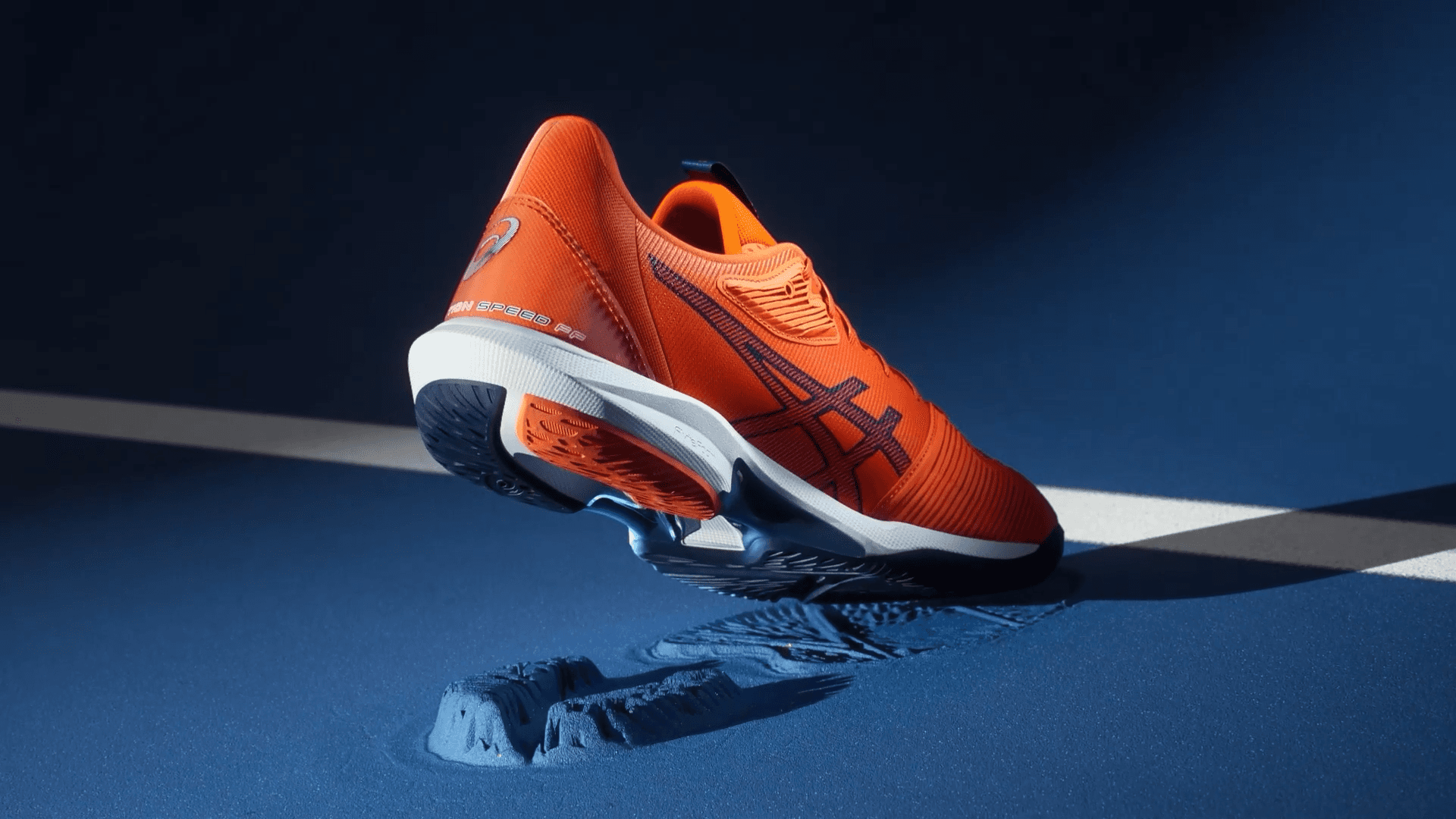
It started with identity
Every strong system starts with assets that earn their keep. We built a library designed to age well — versatile enough to life on a billboard, social post or TVC. The logic was simple: make each piece work hard, get the foundations right and everything downstream gets easier.
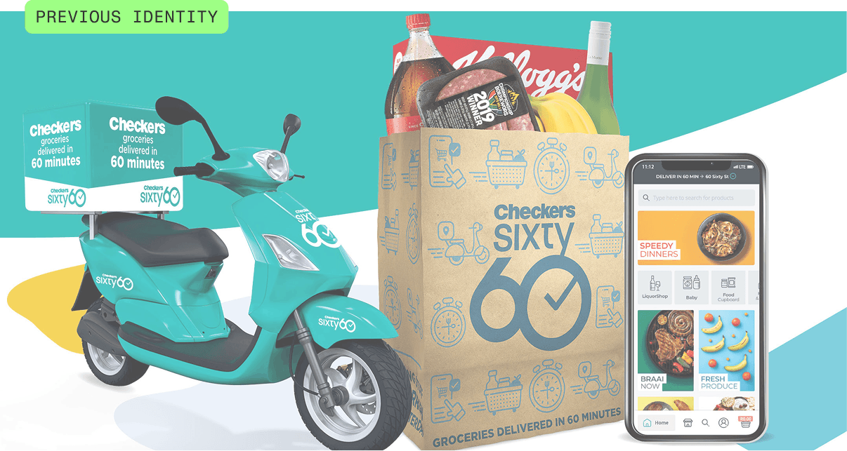

Rather than lean on stock or flat renders, we built the core components as bespoke 3D models — grocery bag, driver, app icons — from the ground up. That meant full control over every angle, every pose, every way a piece catches the light or moves through a frame. Need the driver waving from a three-quarter view? The bag opening for that a-ha moment? A hero icon that animates cleanly? Built to versatility, lit and animated however the moment calls for.
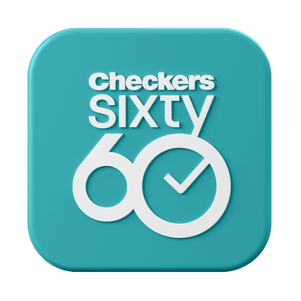
Components for re-use
A brand system designed well is built for speed. We crafted the core components — grocery bag, driver, app icons — in multiple variants, so the team could move as fast as the business needed,


then we started on the interface
With the marketing system locked, we turned to the app itself. Sixty60 had outgrown its original interface — more departments, more products, more happening on every screen. We rebuilt it to bring order and pop back to the experience: clearer hierarchy, better browsing, and a home screen that actually feels like the brand people already love.


Turning the figma file into a system
The whole app once lived in a single Figma file. With a growing team and demand for more functionality to be added, we were tasked to built something more scalable. So we turned it into a robust design system — scoping every state, every interaction, every reusable component. Buttons, links, e-commerce patterns, the lot. Now the team ships faster, stays consistent, and never has to wonder how a button behaves.


And made some 3D icons
Then the fun bit. We redesigned the app's all important department carousel elements into a custom 3D icon set — trading flat line-work for something with depth, warmth and personality. Same categories, more character. It's the kind of detail people don't consciously notice but absolutely feel, and it gives the interface a signature the flat version never had.

Create a set of app icons that are representative of the new departments










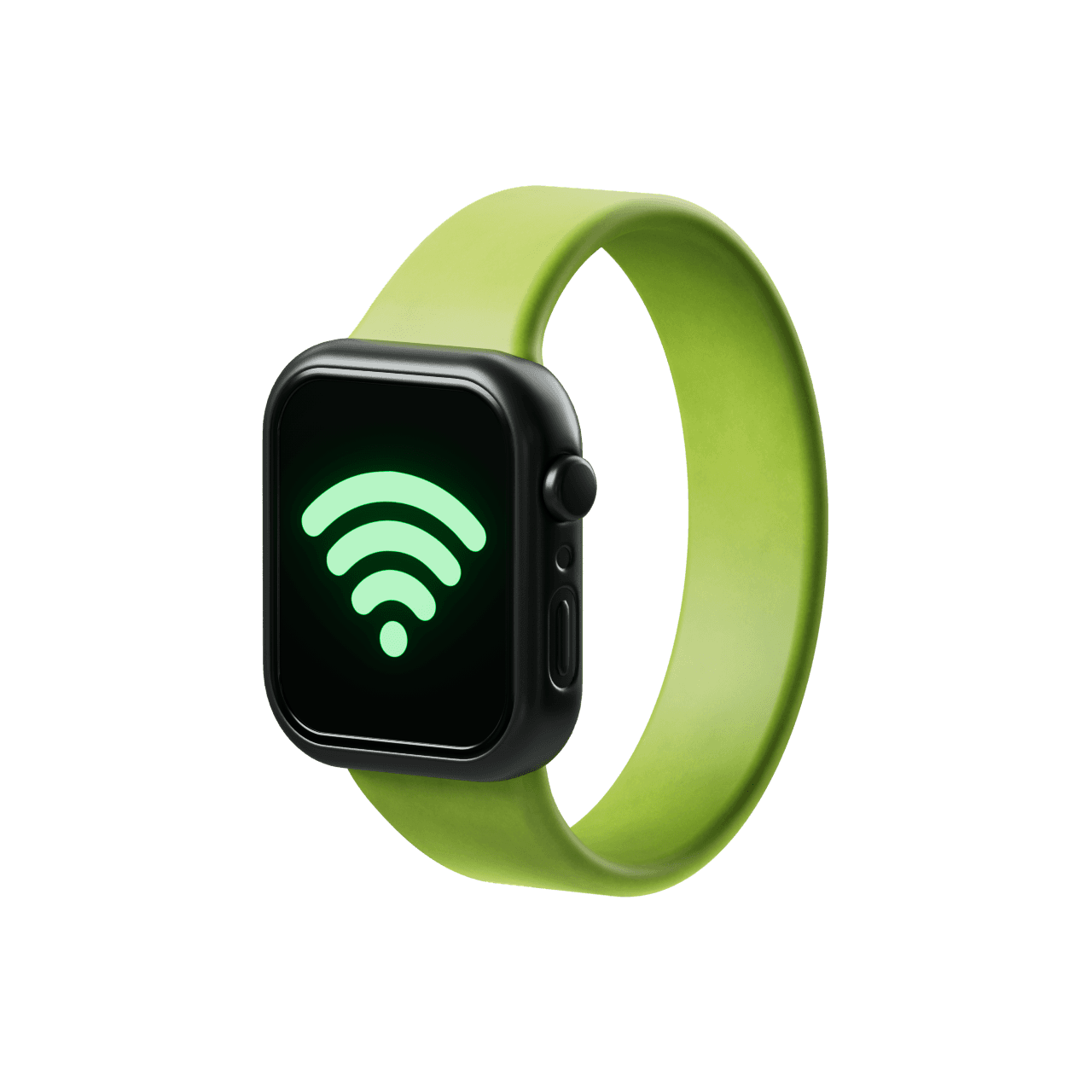
How they show up in the Sixty60 interface

the process
The icon kitchen
Lorem ipsum dolor sit amet, consectetur adipiscing elit, sed do eiusmod tempor incididunt ut labore et dolore magna aliqua. Ut enim ad minim veniam, quis nostrud exercitation ullamco laboris nisi ut aliquip ex ea commodo consequat. Duis aute irure dolor in reprehenderit in voluptate velit esse cillum dolore eu fugiat nulla pariatur. Excepteur sint occaecat cupidatat non proident, sunt in culpa qui officia deserunt mollit anim id est laborum.