
The logomark
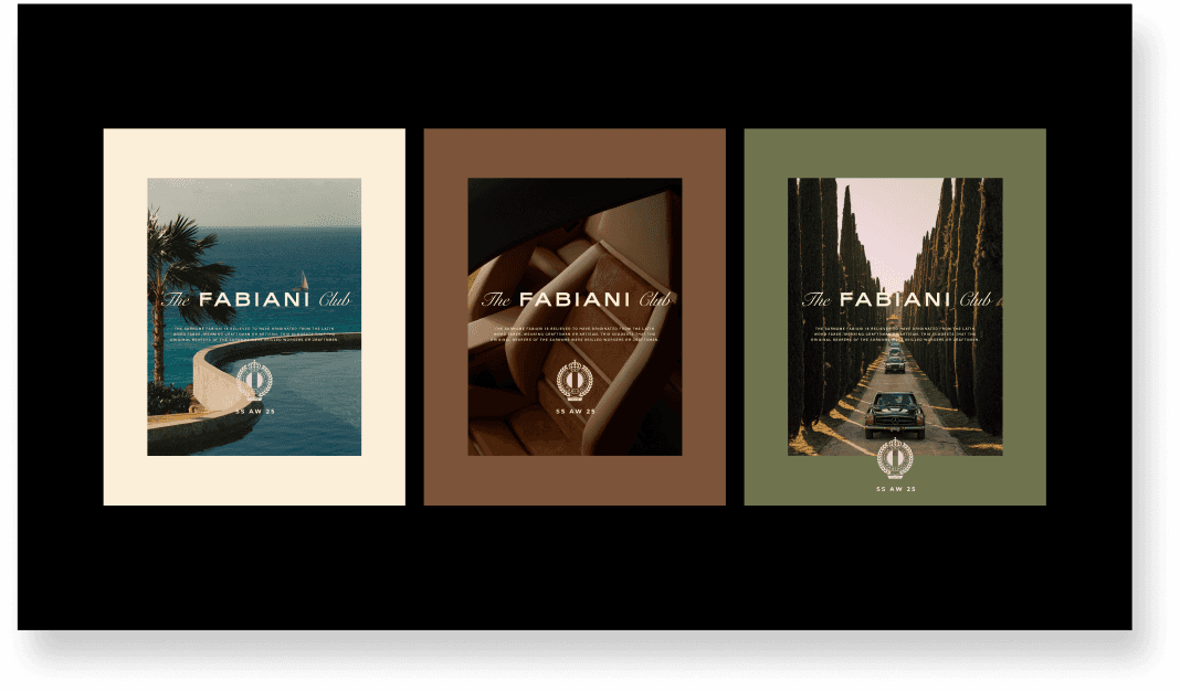
The crest had to work embossed on leather, foiled on packaging and clean on screen. We refined and modernised the existing mark — tightening the wreath, simplifying the crown, consolidating the type — so it reads as effortlessly at wax-seal scale as it does across a shopfront.





THE typographic system
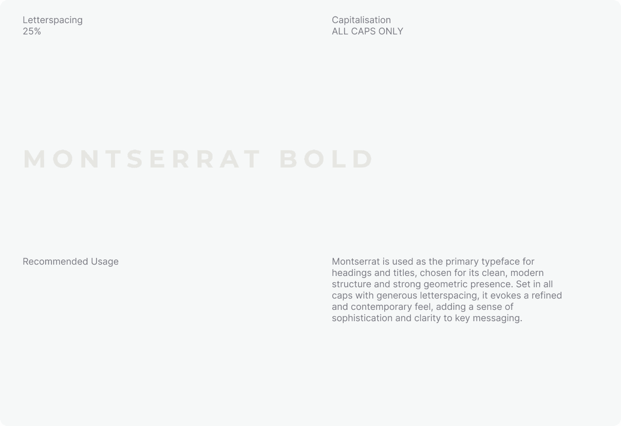
We defined a full typographic hierarchy across four faces, each with a job. Montserrat Bold carries headings and structure; Snell Roundhand adds decorative flourish, used sparingly; Ivy Mode brings weight to campaign call-outs; Acumin VF handles long-form and small-print legibility. Set with generous letterspacing and strict case rules to keep the whole system feeling composed.


THE monogram
We drew a custom monogram built to flex between two roles. Spaced out and high-contrast, it becomes a striking display element; tightened and knocked back, it reads as texture across fabric and collateral. One mark, two behaviours — same DNA throughout.

Display
Adding more space between the instances of the monogram symbol creates a less busy pattern and paired with a higher contrast colour treatment can be a striking visual element.

Texture
Reducing the spaces between the monogram symbols unified the pattern to read more unified and paired with a lower opacity / contrast colour treatment can be effective texture for fabric and other elements.

additional collateral
We extended the system into everything the brand touches — sale assets, packaging, patterns and print — so it holds together whether it's a 75%-off tile or a foiled shopping bag. The details are where a premium brand either earns its price or doesn't.


the brand guide
All of it lives in a single 170-page document: art direction, logomark, crest, type, monogram, collateral — every rule, ratio and reason set down in one place. Not a mood board. A working manual precise enough to keep Fabiani looking like Fabiani, whoever's holding the file.